The Dark Corners of Your UI
The other day, the engineering manager on my team was testing some stuff and happened upon this heartbreakingly terrible interface:
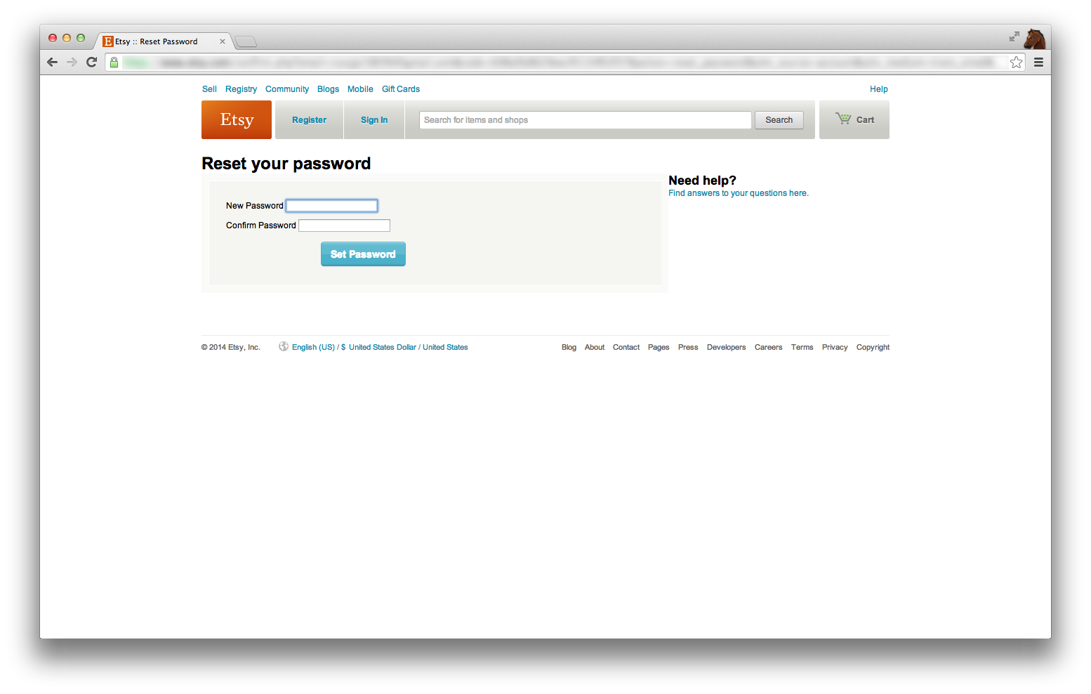
He pinged the designers and we obviously filed a design bug immediately to bring that page up to any kind of snuff. However, the discovery of that UI got me thinking about all the dark corners in our software we let sit and rot away. These are the parts of our flows that either aren't immediately ROI positive or are hidden from us because they're either edge cases or a part of the product we just don't see very often. I challenge you to take a fresh look at the following pages/flows in your product:
- New user on-boarding.
- Empty states (particularly for new users).
- Password and email resets.
- Email confirmation prompts.
- Emails you're sending.
- User Settings.
- Closing an account.
What I've seen time and again is that people gravitate toward working on projects that are measurably and immediately impactful. It makes sense. There's a certain glory and fulfillment in increasing conversion on the Sign Up screen or getting people to create more content or to buy more stuff.
But these dark corners of your interface, while they may not kill your software outright or directly impact your key health metrics, have the ability to gently erode the trust your users place in you. Would I believe Etsy is a trustworthy site if I forgot my password and was confronted with that interface and abysmal Help copy? If a service wasn't quite right for me, but made it really hard to close my account, would I recommend it to a friend that might need it? When I'm confronted with twenty checkboxes when editing my email settings, am I likely to think the service respects me as a customer?
It's easy to tackle the fun projects. The projects that visibly move the needle or that blaze the trail with new technologies and processes. It's harder to remember to check the fringes of our applications. To try out being a new user from time to time. At Formspring and Zoosk, I would frequently delete my dev accounts entirely and force myself to start fresh. At Etsy, there are folks who have all our emails turned on and look at them every day. Whatever the process is by which you care for the nooks and crannies of your applications, the end result will be happier, loyal users and a more holistically thoughtful product. And while not paying attention to those areas may not kill you right away (or maybe ever), the sacrifice to your users' experience isn't worth avoiding the effort.